Year Ago Calculation Without Time Series Functions

First, let’s make a valid use case for this scenario.

OBIEE Dashboard Prompt object contains one or more user input controls. User can input values and submit them by clicking on “Apply” button. In newer releases of OBIEE there is support for auto submission of prompts depending upon your configuration.

Why we need to submit multiple prompts?

Consider below scenario.

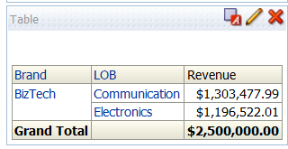
You would like to give users a choice to select two different criteria’s for selecting products. You would like summarize results from first criteria as “Selection 1”, from second criteria as “Selection 2”.

These selections are reported in analysis for comparison.

Design 1

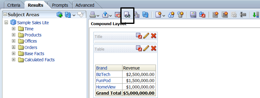
Below is a sample screenshot of dashboard that attempts to provide this functionality.

img1

Issues with design 1.

  • There are two apply buttons.
  • User can only make one set of Brand & Product selections.
  • Clicking on Apply button can submit only that prompt.
  • Any changes made in the other prompt are simply lost and are not submitted to dashboard.
  • So, this solution is a two step process. User submits selection 1, then selection 2.
  • If users are not properly trained this would lead to confusion.
  • Also there other cosmetic issues like analysis not aligning in dashboard properly.

Design 2

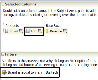
Since most of the issues are related to how Apply button works and prompts are submitted, it is obvious that only one prompt with both selection 1 & selection 2 inputs.

img2

Issues with design 2.

  • If users make a mistake and want to reset selections, both selections would be lost.
  • May lead to confusion if several input controls are involved in each selection.
  • Both selections are in prompt, so it will lead to confusion.

Conclusion: It appears that is not possible to submit more than one dashboard prompt in one click. Combining both selections into single prompt leads to confusion & bad UI.

Below is the solution I’m proposing.

Design 3

img3

  • Keep 2 separate prompts for Selection 1 & Selection 2. (Similar to design 1)
  • Hide apply & reset buttons for these prompts.
  • Create a third prompt that combines input values from Selection 1 & Selection 2. (Similar to design 2)
  • Keep combined prompt in a separate section & hide using “display:none” in custom CSS.
  • Add a custom buttons on dashboard for resetting Selection 1 & Selection 2 prompts.
  • Add a custom “Apply” button, which is named as “Compare”.
  • Write a JQuery script to move selected values from Selection 1 & Selection 2 to combined prompt. Submit hidden combined prompt.

Summary of Design 3 Solution: Individual Selection 1 & Selection 2 prompts are used for UI only. Compare button apply these selections in combined prompt. Since combined prompts is submitted, Dashboard gets are selections in single click. So, we have win-win situation. Dashboard has better UI, we are using very little custom code to make this happen.

Design 3 Implementation Steps

Img 4

Prompts

Arrange Selection 1, Selection 2, Compare (Combined Prompts) as displayed above.

Hide Column 4, Section 1 by entering custom CSS code “display:none” in section formatting options. Select “Use Custom CSS style” option.

HTML & JavaScript, JQuery Objects

Note: Add them as TEXT objects as displayed above. Select “Contains HTML markup” check box.

Reset Button for Selection 1:

Reset Button for Selection 2:

JQuery Code: It has functions for Reset1 , Reset2, move & submit selections to combined hidden prompt


Archive for the ‘OBIEE Dashboard’ Category

OBIEE has a fairly simple EDIT interface for allowing ad-hoc users to create and modify reports (analysis). Sometimes you will come across business use cases where using edit is simply too much for users. Business users deserve a simple interface for dynamically filtering a data set that is presented in dashboard. It has to be simple and easy to use for users with basic level of technical capabilities.

In this article we will discuss few options for building “Dynamic Where Conditions” to offer simple filtering capability at runtime.

Below is an example of dashboard that allows users to select Column, Operator and Value to filter results.

concept

As shown in below screenshot, Product & Region prompts are built using out-of-box functionality.

prompt_for_operator

Main Concept behind this example is the ability of OBIEE to support presentation variables in where conditions. We don’t need to use jQuery to achieve this functionality. However I’m using jQuery to make this little nicer and also have the capability to prevent invalid input values and build only valid WHERE conditions.

Details:

prompt details

Where clauses in Analysis:

where_conditions

OBIEE 11g New Feature – Hierarchy Columns

Although OBIEE 11g won’t be launched for a few days, I’m going to start giving you a sneak peak at some of the features of the upcoming release. I’ve enlisted the help of some of our top OBIEE consultants who have been working with the product and Oracle Development for a while now.

Sharing his thoughts on the new Hierarchy Columns in this post is guest blogger Doug Ross. Doug is one of our top OBIEE consultants and is a 15 year Oracle veteran.

OBIEE 11g Hierarchy Columns

by Doug Ross

OBIEE 11gR introduces the concept of a “hierarchical column” which allows for encapsulating the presentation of a dimension hierarchy in an Answers analysis report within a single column. The advantage of the hierarchical column is that it offers a better user experience in navigating within a hierarchy.

In prior releases of OBIEE, navigating through a dimension hierarchy was limited to drilling down from one level to the next which added new columns to the output. For example:


Clicking on the Type of column header results in adding a new column, “Brand”, to the results.

This drilling behavior is still available within OBIEE but OBIEE 11g provides a more powerful method for interacting with the hierarchy by offering the ability to expand and collapse individual levels within the same report column using the plus (+) and minus (-) icons adjacent to the displayed member values.


This screenshot shows how the user selects a hierarchical column in OBIEE 11g Answers. Notice the new icon for the hierarchy column type.


Here are some sample screenshots of the hierarchy column in various states of expansion. Notice how all the drilling occurs within the same column.


There are two basic types of hierarchical columns: level-based and value-based. As with OBIEE 10g, the hierarchies are configured in the Business Model and Mapping layer of the OBIEE repository (RPD) using the Administration tool.The hierarchies can then be exposed within Subject Areas in the Presentation Layer.

A level-based hierarchy follows the general style where a dimension column serves as the parent to a different child level column. The product hierarchy in the examples shown above would be an example of a level-based hierarchy.

A value-based hierarchy uses the same dimension column for all levels but relies on other structures in the data model to identify the parent-child relationship. A good example of a value-based hierarchy would be within the employee dimension where the manager to staff relationship exists.

In the screenshot below, the Sales Rep Hierarchy is added to an analysis. The same Sales Rep column is used for all levels of the hierarchy and there are other data elements that define which Sales Rep reports to another Sales Rep.

Drilling into various Sales Rep values shows the organization reporting hierarchy.


As you can see, the new hierarchy column feature of OBIEE 11g provides a very powerful way to increase the usefulness of drilling within an Answers analysis view.

A Comparison of OBIEE Drill Downs vs. Hierarchical Columns in 11.1.1.x

Choosing between a hierarchical columns or using a drill down depends on the purpose of the analysis, they both have positive qualities to them. Hierarchical columns allow the user to expand the column to reveal more information on the report but it also gives the option to condense the column back without affecting the selection of the data for the column. If the drill down column is used, the user will not be able to revert back to the original grouping when the dashboard was first opened because it affects both the selection steps and filters.

Hierarchical columns will appear like the following in the Results section of the analysis

Image1

This is a “top down” hierarchy because the cluster starts with one and splits from there. We can see that the user can select the pluses and minuses to expand and contract the hierarchy

Image2

This allows the user to navigate to where they’re interested in.

Using the column drill down is slightly different because there are no pluses and minuses for the user to select. Here the user will be able to select click on the individual element in the brand column:

Image3

(Criteria Tab)

Image4

(Results Tab)

If you try to drill down in the Results tab it will create a filter in the Criteria tab that the user will need to delete before moving forward.  Here I selected the BizTech brand in the Results tab :

Image5

(Results Tab)

After clicking on BizTech, it introduced a new column into the analysis “LOB” and created a filter as seen below this may be an unwanted action:

Image6

 (Criteria Tab)

If you are not interested in created unwanted filters when drilling down an alternative would be to open “Show how results will look on a Dashboard” in the Results tab of the analysis:

Image7

And then the user will be able to drill into the data without filters or additional columns being added to the analysis:

Image8

There are no pluses or minuses to expand and contract the hierarchies but the user can select ALT-Left arrow to navigate back to the original grouping.

Both methods provide the users with sufficient ability to drill down. The style that should be used should be dependent to the way the user would like to see the data.